


You guys are all using Photoshop as it is supposed to be used, or how it seems.
I use it for two things. Putting together a general web design, and putting together comics or comic-like things. It turns out Canon doesn't create drivers for my scanner that are compatible with Windows 7, so I am learning to just go from scratch with the Wacom tablet. It has been interesting, and I've begun to experiment with brushes for the first time. Unfortunately I don't think I'm really any good with them, but outside of Photoshop I've only really enjoyed black and white art, and if I do color I prefer it with colored pencils or prismacolor markers so that it looks as close to solid-color as possible.
Here's a few examples of art I've done did:
Web Design:
I finally got a front page look I liked, and since then I haven't gone back to it. I've been having trouble motivating myself to help out my local College and Careers Church group. I plan to get back to it, though.

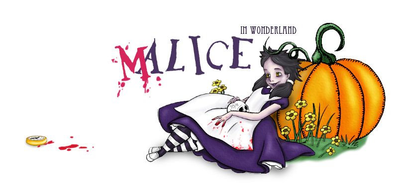
Artwork:
I made t-shirts out of both of these. The Big Daddy one is HUGE compared to the Samus one, but I really like how both turned out.


Comics:
Yeah, I'm working on a new one, but I eventually plan on getting back into GameLandEtc. one day.


It's interesting to see the subtle improvements in the artwork. Even more so when I was recycling background art for the game store that was old as Hell. At one point my friend Phil was in charge of colors, but I had kept on with "inks" and lettering. Finding a good font for text can be a bit rough sometimes, but I started getting really good with different sound effects.
Current Project:
I've been blogging my current project, which is where I'm experimenting with art sans a pencil sketch. I've actually learned the value of "blue pencil" sketching in photoshop.

I hate coloring.


I really, really hate coloring.

At this point I'd love to know if there's a brush I can use (other than the basic "pencil") where paint bucket functions as promised. Otherwise there's always that weird 1 or 2 pixel gap of white between the lines and the color.


For this one, I'm going to remove myself (just the human parts, not the clothes) from the following photo: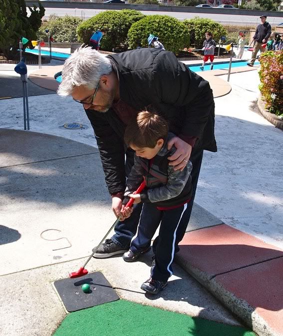
So, step 1:
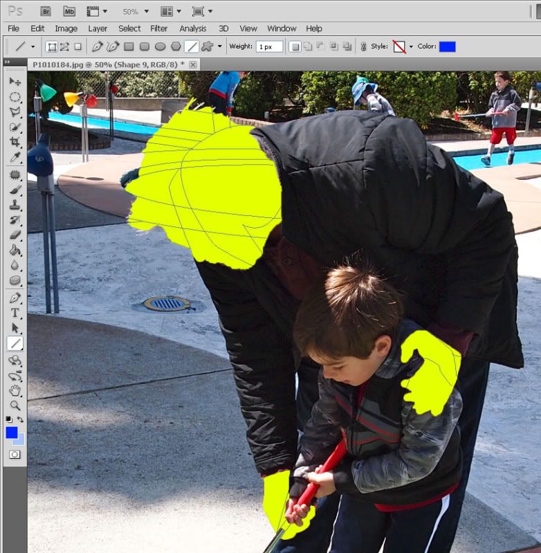
This is going to be harder than it looks. There is a LOT of background data that needs to be built back into the photo. In order to visualize it, I remove the parts of me from the photo, and leave a bright background so that I can very easily see the parts I will need to rebuild. This is a sloppy removal, as the pixel work will take care of any remaining details (like my spiky hair) that I missed in this first part.
Once I have the pieces removed, I use the pen tool in photoshop to recreate the lines that will need to be build back into the image. The ellipses of the golf hole as well as the straight lines are easy. The lines of the jacket? Not so much. A LOT of fakery will have to go on before I get that right. After a few minutes I have the following:
I also accidentally deleted the photoshop file while uploading this, so it will take me a few minutes to get back to this stage. Once I do, I will continue to post until it's done.


@ccesarano,
Very cool looking stuff! I've used Photoshop for basically everything, although I don't really draw... I really want to get into it though.
In regards to your question about the Paint Bucket, I think it's a little limited by what you are talking about. You can play with the tolerance, but I think that affects how many colors it will spill over into, like if you click to fill white with a tolerance of 32, it'll move 32 shades away from white, probably affecting grey's. I don't think you can set it to work with gaps though.
From what I've seen in tutorials and stuff around the web, it seems like most people use the paint brush to fill in color. If you want to color the way you are coloring, set the hardness to 100% and you can get it right to the edge without any fading/bleeding.
I don't know if you only own Photoshop, but if you have on of the packages you might also try Illustrator, I think that has a Paint Bucket tool that does more of what you are looking for. Plus, vectors are wicked awesome, but definitely different to work with than pixels.
Another program you might check out if you're serious about drawing comics on the computer is Manga Studio. I picked up the EX version for $50 from Amazon. I just felt like I needed it for some reason. Thought it would motivate me to get drawing. But it's got a ton of useful tools for comic drawing, and might have some more helpful tools than the Jack-of-all-trades Photoshop.
Also, in regards to web design, as that's what I do for work these days: I don't know if you made that image smaller or not, but when using Photoshop for web design, do your best to work 1:1 for pixels. This helps the coder when you're finished, but also helps you see exactly how it will look. Try working with a specific width for your website, you can use something like the 960 Grid to get an idea about that. I do zoom in a lot, but I always click Ctrl+1 to get to 100% to view the whole page, and I also make judicious use of the Marquee tool and the Info window to measure. And one more thing that helped me IMMENSELY when I started using PS for websites, the Move tool (V Key) with Auto Select [Layer] turned on. Sooooooo amazingly helpful.


I don't use Photoshop for website design in those big monolithic chunks anymore. I mockup with flat HTML and draft images, then print them out rather than display them on a screen. You can write checks with images your ass cannot cash in code too easily the other way. ![]()
I do have a question for the room, though. I'm working on convincing our CTO that I really need an upgrade to Photoshop. I've been stuck using version 6.0 (note lack of CS nomenclature). I'm staring down the barrel of an extremely long overdue full skin redesign and I'd like to have the new tools both from an image-creation standpoint and the mobile development tools they've added to the Web and Design version.
But I have started second-guessing myself. Will that not actually make my job any easier?
Does anyone have any input on that?
Guess I should post some things I've done as well.
This is a recent website I did, it's mostly text. I only did the design, but it's been coded for Wordpress and is live here. (Click images for full view)

And these are some icons I did for a Johnny Carson Facebook game that I don't think ever got created, but I got some money out of it.


I also did a game GUI for this fellow over in Norway about a year ago. I don't know if he ever finished that either...
http://kalenjohnson.com/portfolio/ui-design-for-dungeon-rogue


Bit of vidja game related fan art I did ages ago for a website...can't remember why. Probably sleep deprevation...
started with a quick snap from WOW and a photo from her site...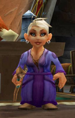
Turned it into this with random google images and a bit of painting over the top...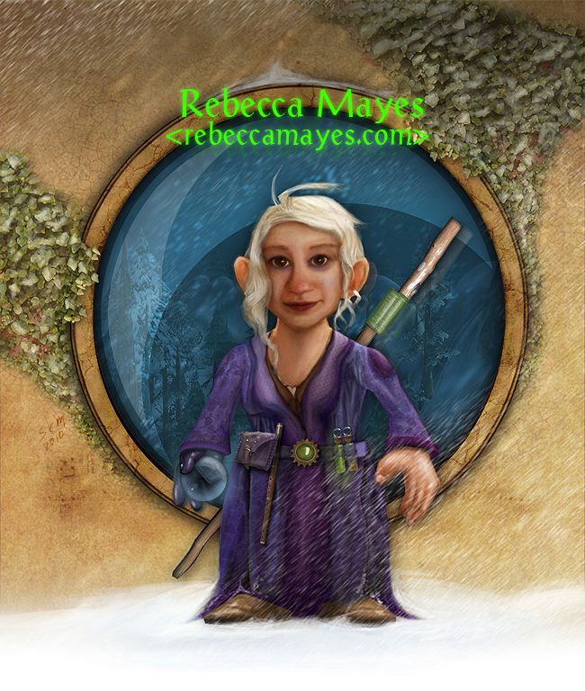
*****
Illustration for a local halloween event a couple of years ago. A bit of a 'shop of the disney version and then coloured.
Forgot to mention, your stuff looks awesome Jeff-66.
@momgamer I don't know all the tools you use, but if you're thinking of alternate programs maybe try Paint.NET? I haven't used it for much, but I know it can do a few things that Photoshop can do. But as it is a passion project it is still moving awfully slowly in terms of catching up. Obviously others may have a better idea of alternate programs.
@Citizen86 I have Web Premium CS3 I believe. That or the step below that. It has Flash Professional CS3, InDesign CS3, Photoshop CS3, Illustrator CS3 and a couple of other things. I used Illustrator before, but it was just...weird man. One of my former College roommates uses it for his comic Insert Life Here, but I've seen what it looks like without the Pen Tool smoothing things out for him. It's...not pretty.
I tried fiddling with so many paint bucket settings, and what I've learned is you either have that thin empty gap or you overtake it so the colors don't blend and it looks like your rubbed two colors of the pencil tool all up ins.
I'll see if I can grab a trial version of that manga studio.
I haven't studied the 960 grid too much, but for the most part I thought I made that 960 pixels in width. That's the standard I go with for page width and then go from there. I'm basically using the same methodology as I had used for my current web design, which going from image to code was basically 1:1. As I do front-end web programming (emphasis on HTML and CSS, the further I get away from logic the better (why'd I go to school for programming aaaaugh)) I intentionally try and make designs that can be done with as few images as possible, sticking to fancy CSS. Most of the CSS3 I use doesn't really hurt on older browsers either, as it just makes a lot of stuff square.
Nonetheless, I'm considering going to Grad school for a more graphic design oriented education so I can do something a little more fun.
But I have started second-guessing myself. Will that not actually make my job any easier?
Does anyone have any input on that?
Hard to say. I started using Photoshop seriously around CS3, so I'm not sure just how antiquated 6 is, but I can guess. Actually, I know there are some very helpful things like smart objects, non-destructive adjustment layers, and other cool tools I wouldn't want to give up. Some tools have been refined as well, like smarter Levels and Brightness/Contrast settings.
Is it 100% necessary? Probably not, but it can make life easier. I would definitely make a case for it though if your company can spare it.
I can say for certainty that smart objects and adjustment layers can be life-savers, or save a lot of time and effort. You don't have to make a copy of a layer for backup everytime you want to make a change to it, and you can always come back and tweak as needed with adjustment layers.
I don't use Photoshop for website design in those big monolithic chunks anymore. I mockup with flat HTML and draft images, then print them out rather than display them on a screen. You can write checks with images your ass cannot cash in code too easily the other way. ;)
I'm not really sure what you mean by this. Do you mean you might create images that are too big for the web?

You're going crazy with the photo manipulations! They're looking better and better
Thank you.
The apple looks great, very reminiscent of those Annoying Orange youtube videos. If I could give one suggestion to complete the affect, it's with the bow. The shadows fit in nicely, except that it is overtop the apple where it should follow the apple back. I would also bend the bow a bit at the top so it looks like it is sitting back on the apple, instead of straight up and down.
That's excellent advice, thanks. I'm just now starting to learn about light & shadow. And it's not easy getting elements from multiple sources to match. It seems like half the battle is source image selection. I did find this really cool tutorial on light/shadow matching. I'm going to be practicing that, though I wish he'd provided the larger source images.
@ ccessarano, great work. I enjoyed seeing your comics and such. I suck at art, drawing, digital painting, etc, but I'm trying to learn it.
@ Toddland, thanks much for the people removal tutorial, look forward to seeing more. I will try that for sure. Clone Stamp and Pen Tool are two big weak spots for me, I really need to work on improving those.
P.S. REALLY happy to see this thread take off. I was about to give up, as I didn't want to be the lone pic spammer in here ![]()
and ccessarano, thanks for the compliment, I really appreciate it!
momgamer wrote:I don't use Photoshop for website design in those big monolithic chunks anymore. I mockup with flat HTML and draft images, then print them out rather than display them on a screen. You can write checks with images your ass cannot cash in code too easily the other way. ;)
I'm not really sure what you mean by this. Do you mean you might create images that are too big for the web?
No. I work primarily with sites that are heavy on forms and functionality, not just displaying text. The fiddly little bits about the way the various object margins and etc interact in the code will shift, particularly in the case of cross-browser designs that don't use the fixed-width paradigm. When I've done it that way, I've had the suits try to hold me to the pixel-by-pixel design across the board. If you use the browser itself to lay out the objects, show them what it does in a representative spread of browsers, and then divorce it a step even farther by keeping it on paper in the first iterations of the design I find I get much less of this.
@Citizen86 I have Web Premium CS3 I believe. That or the step below that. It has Flash Professional CS3, InDesign CS3, Photoshop CS3, Illustrator CS3 and a couple of other things. I used Illustrator before, but it was just...weird man. One of my former College roommates uses it for his comic Insert Life Here, but I've seen what it looks like without the Pen Tool smoothing things out for him. It's...not pretty.
I agree, Illustrator is very different than Photoshop in terms of how you control it. I did Photoshop quite a few years ago, back in the 6 days for a bit, but just playing around with it. Then about 6 years ago I started using Illustrator for design work, food boxes and labels. After that, I started using Photoshop again and PHOTOSHOP was weird to me, haha. They both have their pro's and con's, but I do have to say that vectors are cool, and if you can get the hang of it, it does some things a lot easier and better than Photoshop does, surprisingly. For being a professional pay program though, it has some rough edges as well.
I forgot to mention, I did the game icons above in Photoshop, but the larger Facebook icons I did in Illustrator, they are mostly vectors with a few raster images thrown in.
I haven't studied the 960 grid too much, but for the most part I thought I made that 960 pixels in width. That's the standard I go with for page width and then go from there. I'm basically using the same methodology as I had used for my current web design, which going from image to code was basically 1:1. As I do front-end web programming (emphasis on HTML and CSS, the further I get away from logic the better (why'd I go to school for programming aaaaugh)) I intentionally try and make designs that can be done with as few images as possible, sticking to fancy CSS. Most of the CSS3 I use doesn't really hurt on older browsers either, as it just makes a lot of stuff square.
Nah, don't get me wrong, I don't usually use the 960 grid either. I just wasn't sure if that's how you were doing it because the image you posted wasn't 1:1, but I'm glad you do it that way ![]()
It's true as well, more and more can be done with CSS3. It's really cool how web design is coming along, it's a really interesting field to be in, and it's always exciting to be learning more. I really enjoy it.
Also, one more extra thing that I use often is CSS3Pie, it's AWESOME for getting some of those CSS3 options into Internet Explorer. Unfortunately, cross-browser support and checking is still a large part of web design, and [i]I agree that things don't all have to look the same on every browser, but it's nice to get it close.
Nonetheless, I'm considering going to Grad school for a more graphic design oriented education so I can do something a little more fun.
I've thought seriously on and off about going to school as well for this type of stuff, but I've decided to save myself thousands of dollars and learn it myself at my own pace. And at least for me, it's pretty rewarding to come so far on finding this stuff out myself.
Citizen86 wrote:momgamer wrote:I don't use Photoshop for website design in those big monolithic chunks anymore. I mockup with flat HTML and draft images, then print them out rather than display them on a screen. You can write checks with images your ass cannot cash in code too easily the other way. ;)
I'm not really sure what you mean by this. Do you mean you might create images that are too big for the web?
No. I work primarily with sites that are heavy on forms and functionality, not just displaying text. The fiddly little bits about the way the various object margins and etc interact in the code will shift, particularly in the case of cross-browser designs that don't use the fixed-width paradigm. When I've done it that way, I've had the suits try to hold me to the pixel-by-pixel design across the board. If you use the browser itself to lay out the objects, show them what it does in a representative spread of browsers, and then divorce it a step even farther by keeping it on paper in the first iterations of the design I find I get much less of this.
Ahh ok, that does make sense. Forms are still my worst enemy, and trying to style them is killer.
Actually, speaking of cross-browser pixel-by-pixel design, I've found that I now love scripts that add the browser name to the body class. This one is pretty nice, it does some cool things, but that is one of them. So if something is off in ie9 only, all you have to do in CSS is .ie9 #form { margin: 5px; }
Edit: This might not apply to everyone, but for some of us, Photoshop is closely linked with web design/coding, so this is all semi-on-topic ![]()
Quick one before bed ![]()
originals:


Love it, Steven. I always enjoyed your 'shop work in the 'what are you playing this weekend' thread.
Nice! That flip of the girl to match the lighting is well done.
A frog and baby alligator. I tried to work on my clone stamp in this one, attempting to skin the gator head with the frog's skin as best I could.

Jeff. Overall, well done! You can sharpen the edges around the mouth. Use shift+] to harden the edges of your brush (in 20% increments) for use in masking and erasing. Shift+[ softens the edges.
I'd be happy to offer other advice if you want it.
Jeff. Overall, well done! You can sharpen the edges around the mouth. Use shift+] to harden the edges of your brush (in 20% increments) for use in masking and erasing. Shift+[ softens the edges.
I'd be happy to offer other advice if you want it.
I forgot when it was implemented, I think it works in CS4, but definitely CS5, you can also hold Alt and right-click to size and change the hardness. Move the mouse left and right to change size and up and down to change the hardness. I find that a much more organic way to fiddle with the brush than the hotkeys
Jeff. Overall, well done! You can sharpen the edges around the mouth. Use shift+] to harden the edges of your brush (in 20% increments) for use in masking and erasing. Shift+[ softens the edges.
I'd be happy to offer other advice if you want it.
I'm always open to tips, suggestions, constructive criticism, etc. Every day I learn a little more. Thanks for the advice. I'm also looking forward to the rest of your people removal tutorial.
Btw, for those interested, Stock.Xchng is an excellent source of thousands of free, high quality stock images. And Interfacelift is a great place to find super high res outdoor/nature images.

It seems this thread is more for photo manipulation than painting, but this is THE best series of tutorials when it comes to drawing / painting that I've come across:
It seems this thread is more for photo manipulation than painting, but this is THE best series of tutorials when it comes to drawing / painting that I've come across:
Oh, nice. Definitely bookmarking that for future use.
I forgot when it was implemented, I think it works in CS4, but definitely CS5, you can also hold Alt and right-click to size and change the hardness. Move the mouse left and right to change size and up and down to change the hardness. I find that a much more organic way to fiddle with the brush than the hotkeys
I'm a hot-key whore. I've been using Photoshop since version 2.0 (not CS, mind you) and most of them are second nature. The cool thing about Photoshop is that there are roughly five different ways to do any one particular task. Just look at how many ways there are to mask things!
People removal tutorial will have to wait until Thursday as I ended up actually doing work at work ![]() Plus I committed the rookie mistake of saving the original version over the redone version when I was taking the screenshots. That's what I get for doing it while I was distracted.
Plus I committed the rookie mistake of saving the original version over the redone version when I was taking the screenshots. That's what I get for doing it while I was distracted.
The next part will cover painting back in the areas and making them look seamless. Liberal use of the cloning tool and noise filters will be used.
It seems this thread is more for photo manipulation than painting, but this is THE best series of tutorials when it comes to drawing / painting that I've come across:
Careful Frederik. Between this and Dragon's Dogma I just may start loving you.
Yeah, I've been viewing Ctrl-Paint for a while now. It's already a very good site, but this Friday (July 6), it's undergoing a major redesign, and will be vastly improved. You can check out the CP 2.0 preview video on the home page now.
I want to thank you guys for this thread (and for that link Frederik_S - that's awesome). It's reminding me why I used to do this for a living.
One uncomfortable realization from it is how long it's been since I've just drawn something for drawing's sake. The last thing I could find was this:
This was the test I threw out when I first got my Wacom and was trying to figure out how to draw on it. That was longer ago than I want to admit to.
I'll be spending some time this weekend fixing my drawing setup so I can try again. It got thoroughly disarranged by my recent computer woes. But I promise I wont share whatever comes out of that. ![]() It's been a LONG time.
It's been a LONG time.
Here are a few more websites I've enjoyed for digital drawing tutorials:
Cartoon Paint - He's not the most lively screen caster, but he has a cool style of drawing cartoons, and has some pretty helpful tips. I think I got all his videos a few months ago in a sale he was doing, but I haven't watched them all yet.
Cartoon Smart - Relatively cheap tutorials, lots on drawing, although many of them are in Illustrator and Flash, not just Photoshop. The tutorials by the site owner, Justin Dike, are pretty high-quality, he's an interesting guy to listen to.
Digital Tutors - A lot of you have probably heard of this one. I haven't actually paid for a membership here yet, at $45 a month, it's a little steep. But for anything 2D and 3D, it's got you covered tenfold.
There's some others, but those ones I've enjoyed. Oh, and if you are into the digital artwork, a subscription to ImagineFX is also a good choice. I found the cheapest digital subscription at Barnes and Noble, $5 a month, paid monthly, cancel anytime.
Another really good one, IMO, is Pencil Kings. It's $10/mo.
Look up Sycra on youtube, he's got a lot of really good drawing tutorials on there. Check out Mark Crilley on youtube as well.
Another really good one, IMO, is Pencil Kings. It's $10/mo.
Look up Sycra on youtube, he's got a lot of really good drawing tutorials on there. Check out Mark Crilley on youtube as well.
Hey, that's a new one for me, thanks!
There's some others, but those ones I've enjoyed. Oh, and if you are into the digital artwork, a subscription to ImagineFX is also a good choice. I found the cheapest digital subscription at Barnes and Noble, $5 a month, paid monthly, cancel anytime.
Highly recommend ImagineFX - probably the only actual physical mag that I buy each and every month these days. You can actually also get it through the Future Ipad app (not sure if that's UK only or not though).
I used to buy Cinefex a long time ago. They didn't have digital releases or subscription outside of England then, though, so I had to go get it from my local newstand. Those were like a coffee-table book. I used to pay $15 a piece for them.
Looks like the prices have gone down signifigantly, and you can get an online version free with a print subscription. I think I'll have to sign up for that.
Pages